Colombino Brand Identity
Colombino Coffee, a shop in Pittsburgh, needed an updated mark that is a nod to its Colombian growers. The owner hired Oscar Carvajal, a Colombian illustrator, for the Mr. Colombino illustration and Juxtaproof handled the type treatment and branding.
The Challenge:
The Exploration:
After some research and discussion, four original type treatments were supplied to the client. The first, featured a hand-done, script style type knocked out of the illustrated Mr. Colombino. It was inspired by script lettering found in art in Colombia and Oscar’s original knocked out type idea. The second featured the word Colombino twice; once in a hand done, condensed, sans-serif style behind Mr. Colombino and once legibly, underneath Mr. Colombino in Urbana, a font by Colombian designer César Puertas. This mark was inspired by Oscar’s wanting the mark to look like a barcode. Both type choices were influenced by Colombian sign painters.The third option featured a hand-done, sans-serif type behind the illustrated Mr. Colombino. This type treatment was inspired by the blocky lettered signs numerous towns in Colombia have. The fourth option features a hand-done, serif style type aimed to authentically showcase the vibrancy of Colombian culture. This fun logo was inspired by business signage and street art.
The Solution:
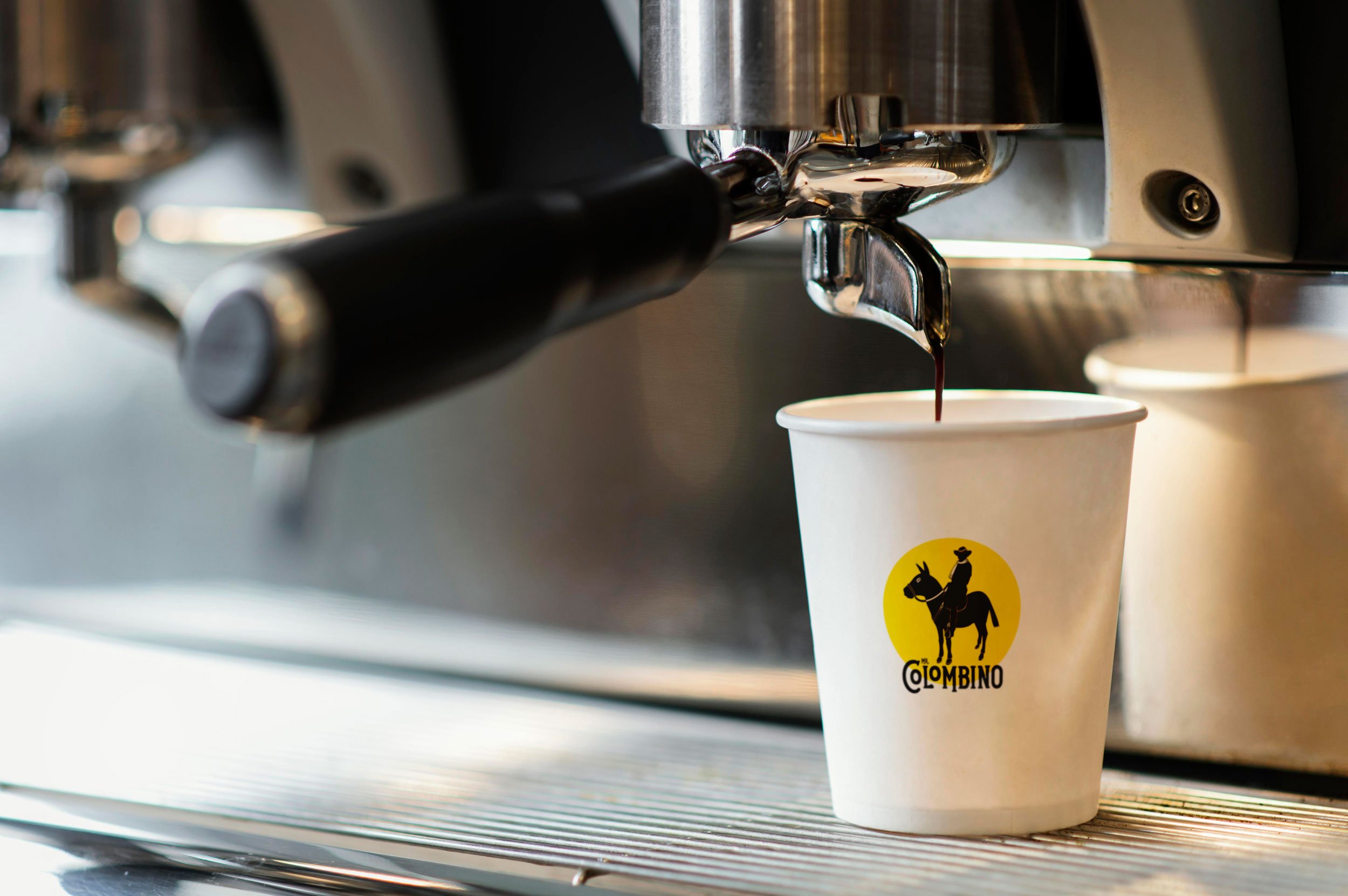
For the final logo, the client didn’t like the name split so we made it one line. The Mr. Colombino logos exist in a few different formats for use in varying circumstances. The primary stacked combination logo with the yellow circle reinforces the organization’s identity and public recognition.
Colors:
Three color palettes were presented to the client all inspired by colors found in Colombia. The first is entirely inspired by the bright birds found in Colombia because Colombia is the country with the highest number of bird species due to its unique combination of geographic and topographic features. The resulting palette focuses on the bright and vibrant colors found in these beautiful species throughout Colombia and will make a lively, fun brand. The second palette presented was composed of images from or inspired by the various ecosystems that work together in Colombia, including plants, animals, and coffee growers. This palette is more neutral, but still features some vibrant colors for the brand. The third color option mostly focused on the regions that Colombino coffee is from. The result is an earthy palette composed of complimentary colors with monochromatic steps in those families. They ended up choosing the palette inspired by the birds.
Typography:
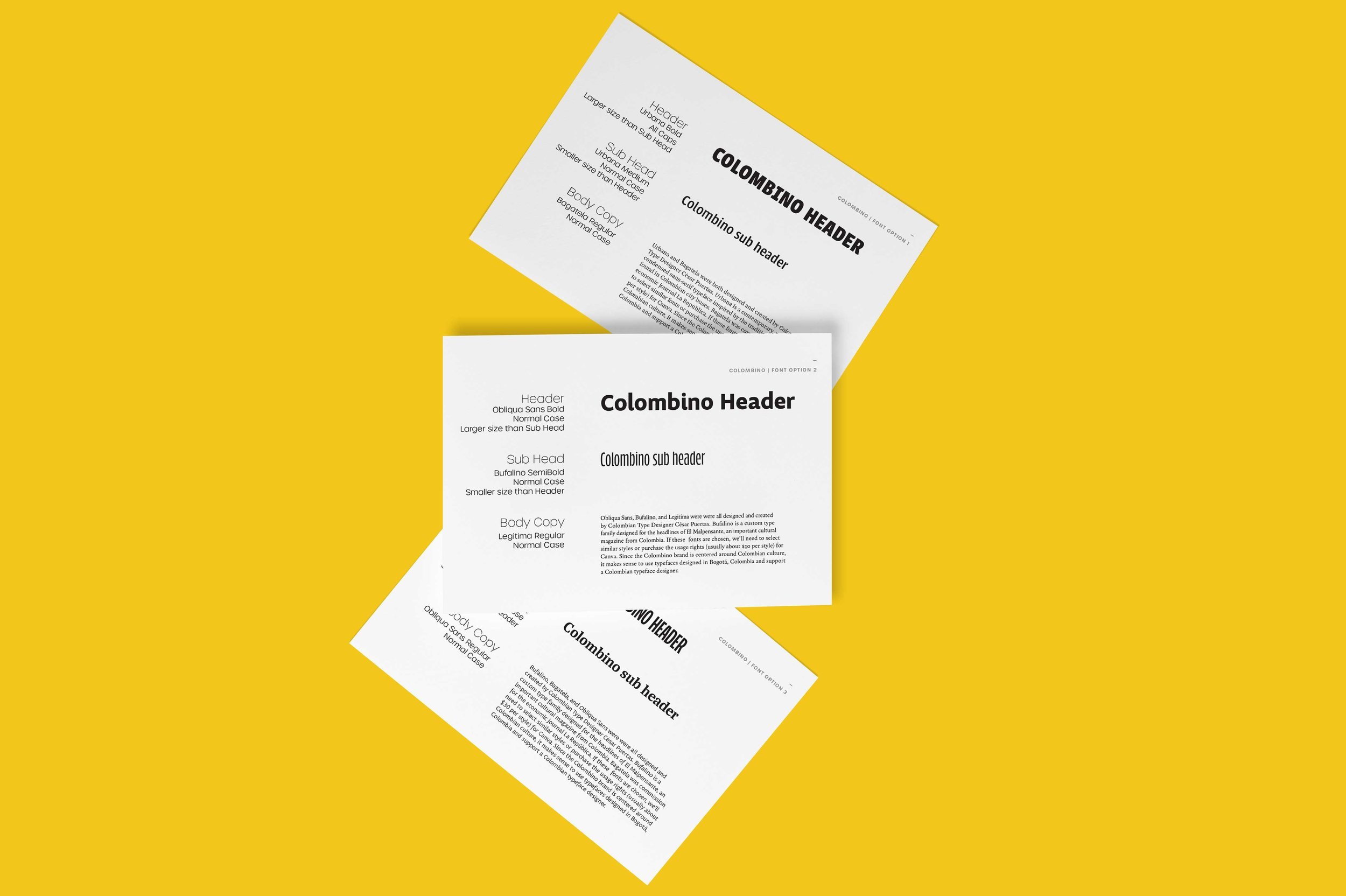
How could a typeface designed by someone that’s never been to Colombia feel authentic to a Colombian brand? It would be missing critical influences. Since the Colombino brand is centered around Colombian culture we only chose potential font treatments designed by Colombian typeface designer César Puertas. The selected typography uses Urbana Bold All Caps for the header, Bufalino SemiBoldfor sub heads and Obliqua Sans Regular for the body copy.


