Move Fly Soar
Brand Identity
The Challenge:
Move Fly Soar provides personal run, swim and triathlon training to athletes just starting on their fitness journey, and beyond to experienced competitors. Whether looking to achieve a new fitness or performance goal, or to refine technical skills, Move Fly Soar has the experience and technical training to coach you to success.
For the logo - having a connection to swimming and running with some water element or running shoes was the preference. The client also wanted a representation of progression like a human form at rest, growing wings and then soaring above the ground.
Brand Scope:
Discovery & Strategy
Logo
Typography
Color
Pattern
Brand Guidelines
Business Card
The Exploration:
After a discovery, research, and brainstorming, we presented four unique options to the client.
The Solution:
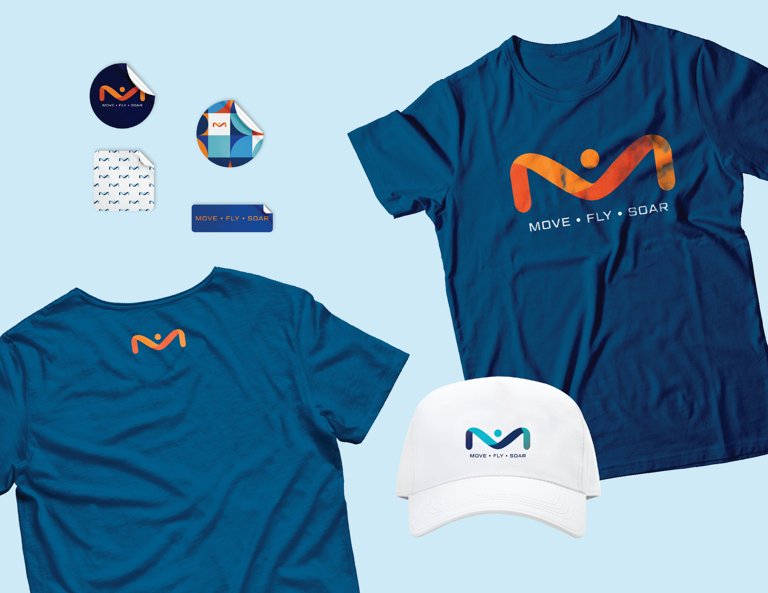
The chosen logo uses the “M” from “Move” as a base. We extended it into a more fluid, elongated shape. This indicates flexibility, motion, and balance (through symmetry). The simplicity supports the desired presentation as an experienced, knowledgeable brand. As a bonus, the elongated “M” also mimics the butterfly stroke’s arm motions, or wings. The font for Move Fly Soar conveys the feeling of being technical, capable, and accomplished. This combination mark can also be used with the symbol or words separately as needed.
Color & Typography
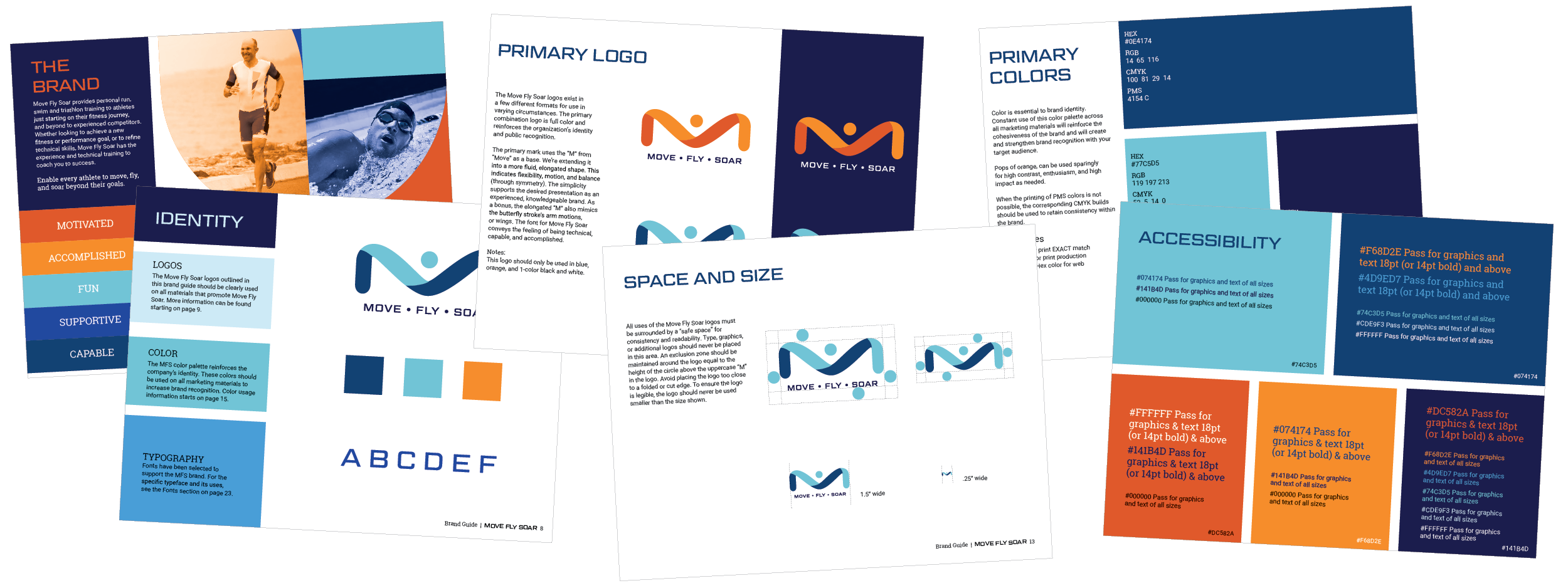
The chosen color palette focuses on bright, uplifting hues of blue. Blue can be associated with success, power, confidence, and purpose - all adjectives athletes should embody. Pops of its complementary color, orange, are used sparingly as a secondary color for high contrast, enthusiasm, and high impact as needed. The primary and secondary colors were specifically chosen to work together and be WCAG 2AA Compliant 18+ or better to ensure website accessibility.
Headlines are set in Geom Graphic Regular. This square, geometric, sans serif was made for a wide range of uses and the letterforms are designed slightly rounded to appear natural, warm, and retro. For body copy, Roboto has largely geometric forms making it an attractive pairing with Geom Graphic. Roboto features open curves, allowing letters to be settled into their natural width which makes it readable as a text typeface. The Roboto Slab family is used alongside the normal Roboto family as an effective pairing for subheadings.
Patterns
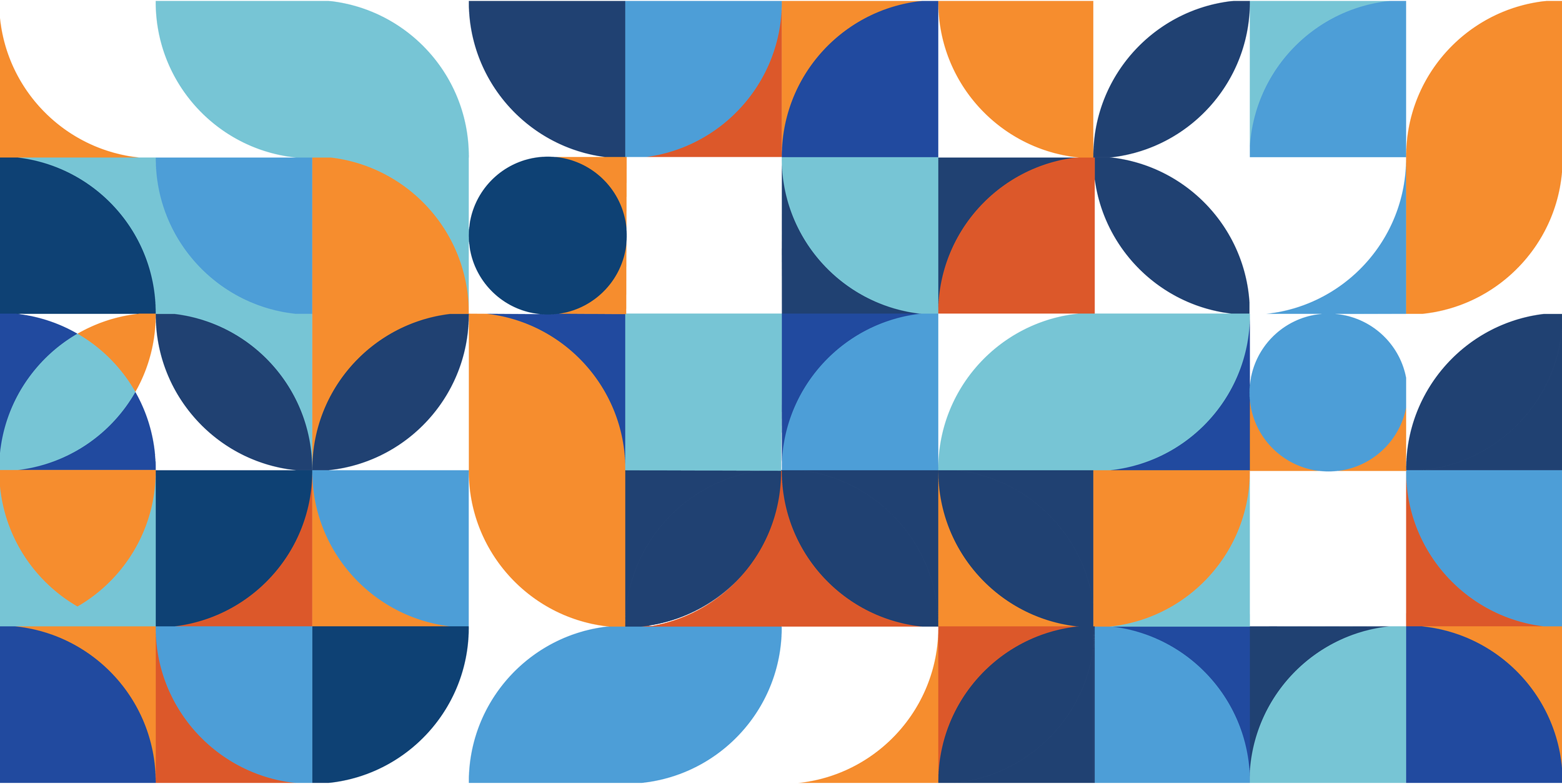
We extended the brand with two patterns. The first, a basic symbol pattern using the M icon, is inspired by photo backdrops people would see at the finish line of a race. The second, is inspired by the geometric, natural, and retro shapes found in the main mark and accompanying fonts.

The Guidelines:
At the conclusion of the branding process we handed the client a document outlining the brand and best practices.


