Nonprofit Partners
Brand Identity
The Challenge:
Nonprofit Partners is a new initiative created to assist nonprofits and other groups to meet to their mission by providing operational and administrative support at a reasonable cost. Many community foundations find this work too expensive to be profitable and want to only work with higher net worth opportunities. Nonprofit Partners mission is to help efforts to make their community better. They needed a strong logo and visual identity that worked cohesively with the parent company’s brand.
Brand Scope:
Discovery & Strategy
Logo
Typography
Color
Pattern
General Best practices sheet
The Exploration:
We conducted two rounds of exploration, the first using the parent company’s colors.
Option 1A
Option 1A intended to tie into the branding of the parent organization, while still creating a unique identity for NonProfit Partners. The Community Foundation’s “swish” is carried into the new logo to emphasize forward motion and progress. An oak leaf is included to symbolize strength, support, and honesty. Oaks are also often used as imagery in financial institutions, tying into NPP’s mission of helping others with fundraising.
Option 1B
Option 1B had the same symbolism as 1A with the “swish” and oak leaf, but with a friendlier, more dynamic, less corporate type treatment that follows the flow of the leaf.
Option 2
Option 2 focused on the growth aspect of Nonprofit Partner’s mission. The simple, abstract N and P form budding leaves to represent growth for the region. The clean, san-serif font illustrates the modern focus and pairs well with the fonts that Community Foundation for the Alleghenies uses. Color is used to highlight the N and P.
Option 3
Option 3 is a rough sketch of ahand lettered wordmark that highlights the partnership aspect of Nonprofit Partners with a handshake. It is unique and friendly but set in italics to be more professional, emphasize the the name, and make it feel like a separate entity from Community Foundation for the Alleghenies. The favicon rotates the handshake to resemble a heart shape.
The Exploration:
The second exploration focused on using the parent company’s primary font. Following the thorough exploration, we concluded that this company warranted its own unique colors and font.
-

Option 1
Option 1 took the original wordmark portion of option 1A and combines it with the leaf icon from option 2. The simple, abstract N and P form budding leaves to represent growth for the region.
-

Option 2
Option 2 took inspiration from the original icons and envisions the N and P in the shape of a maple leaf since the red maple is the most abundant tree in Pennsylvania. Maple symbolizes strength, longevity and success.
-

Option 3
Option 3 is more modern and geometric than the the original leaves. The generic leaf shapes are paired to emphasize partnership and collaboration. The “N” shape making up the stems is subtle enough to only be realized on a second look.
The Final Solution:
Color
Once we decided that Nonprofit Partners would have its own colors, we explored two different options, while keeping making sure both palettes can incorporate the Community Foundation for the Alleghenies blue and green, or act separately. Option 1 takes inspiration from its purpose - the region the organization supports. This color palette samples blue, gray, tan, and green hues from its communities - Bedford, Cambria, Somerset, and Indiana counties. Blue is associated with being unique.
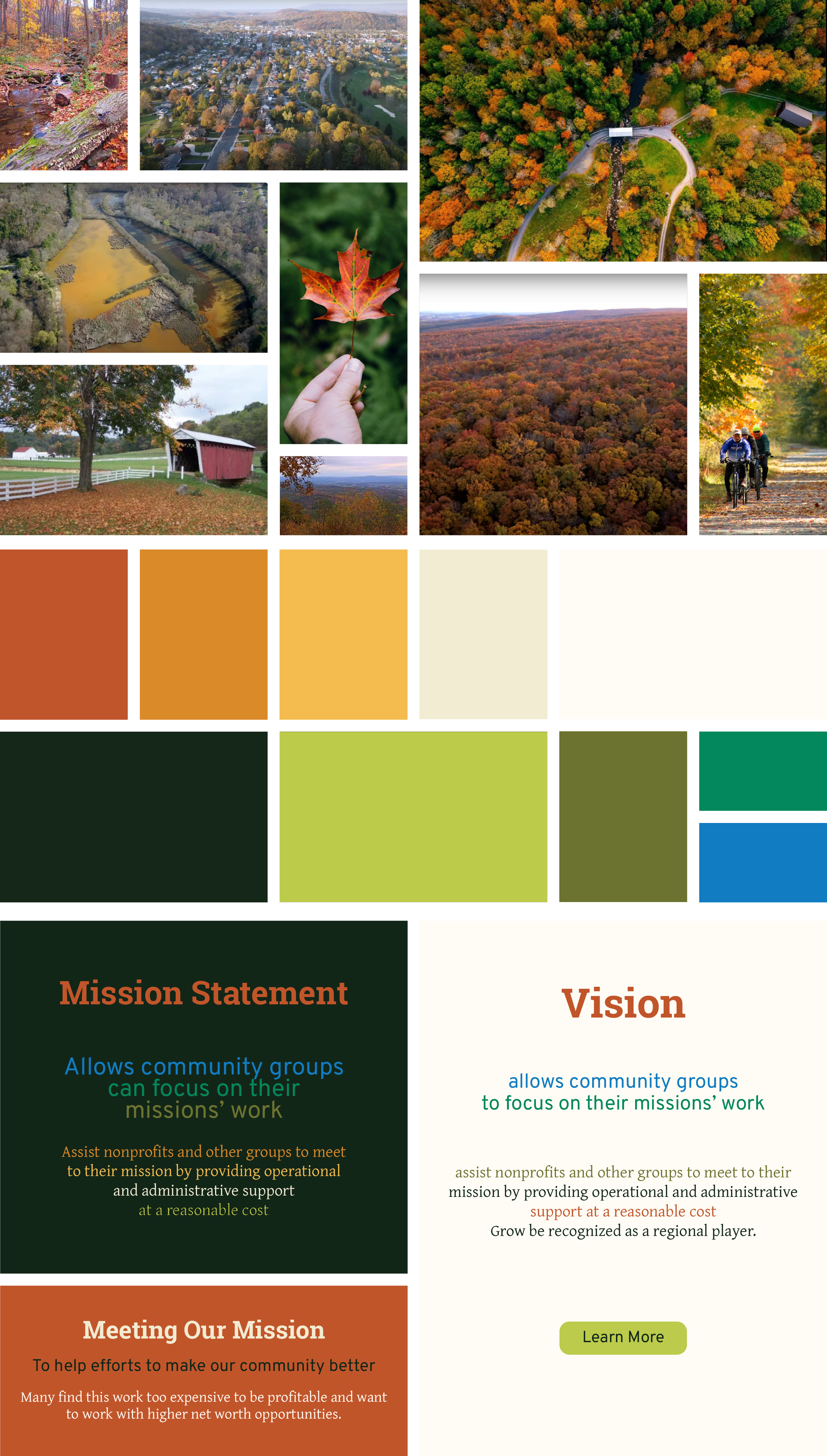
Option 2 takes inspiration from the beautiful changing fall foliage in Pennsylvania. The northern United States is one of the only places in the country where people can experience these vivid, changing colors. Just like the changing in seasons bring these changes on the trees, NonProfit Partners will assist its partners with big, bright changes in their season of partnership. Nonprofit Partners moved forward with color option 2.
Two Color Logo Exploration
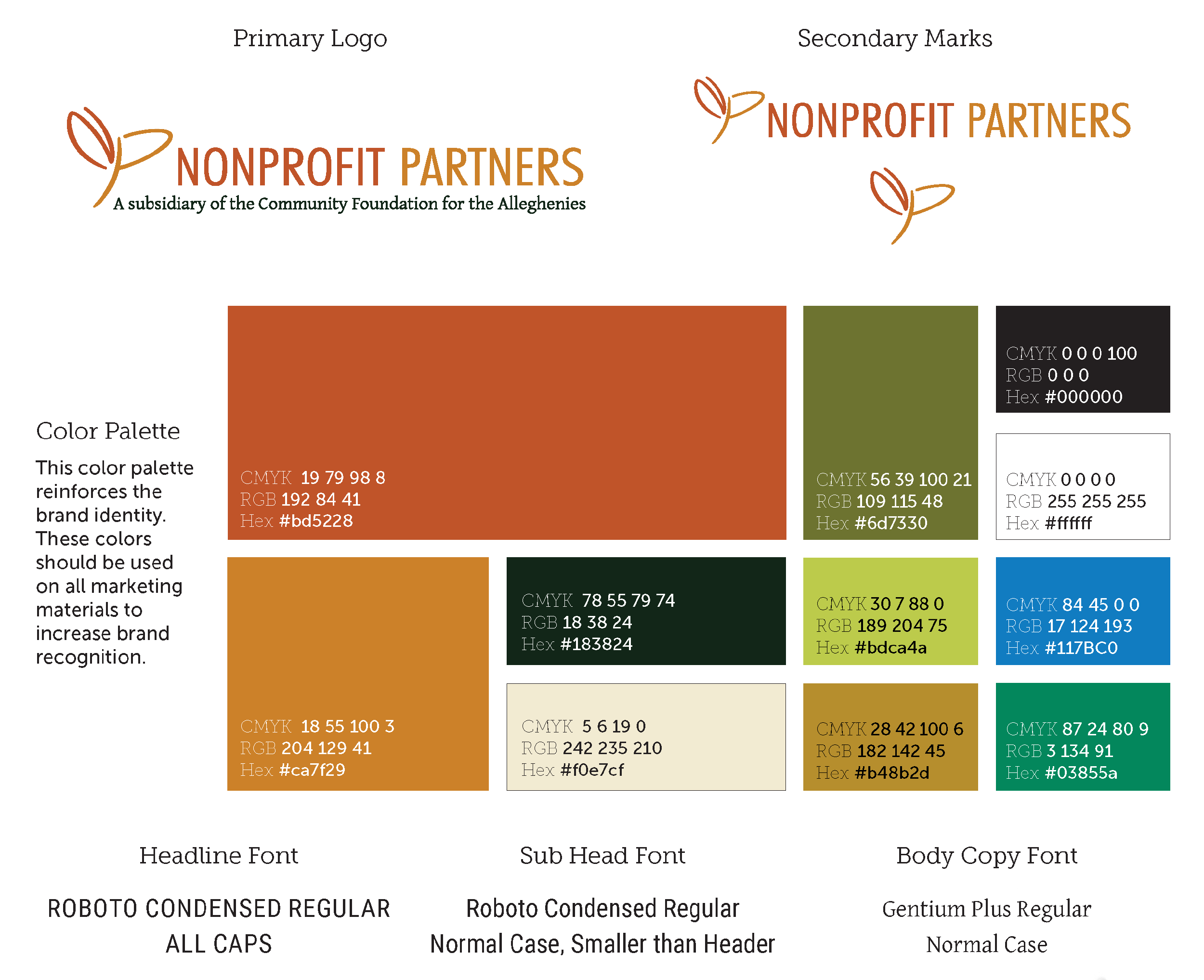
Once we nailed down the color palette, we wanted to apply these new colors to the selected logo. These 2-color options were presented since they use specific colors in the palette that have enough contrast to be WCAG AA Compliant on dark or light backgrounds to maintain consistency throughout the brand. The subsidiary wording would change from dark to light depending on usage. The final logo is also provided in 1-color options.
Typography
Two font options were presented that were intentionally selected to work cohesively with the fonts used in the Community Foundation for the Alleghenies brand while still feeling unique and professional.


